Tim Horton's
Campaign support
We have been collaborating with Tim Horton’s over the years across multiple projects and campaigns – all in aid of supporting them with their new store openings, product launches and flagships.
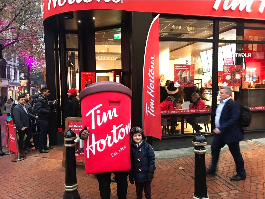
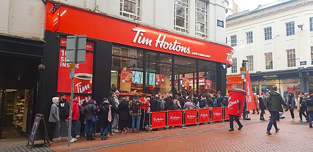
To help Tim Horton’s generate buzz and excitement for their new store opening in Birmingham City Centre – we created a giant branded coffee cup mascot – a playful, larger-than-life character that would become the face (and body!) of the launch day experience. From welcoming eager customers to drawing in curious passers-by, the mascot played a key role in building energy and attracting attention on a busy high street.
Our objectives were to:
1. Create a memorable, ‘Instagrammable’ moment for opening day
2. Drive footfall through visual appeal and live interaction
3. Engage customers in a fun, on-brand way before they even stepped through the doors
We designed and fabricated a fully-branded, wearable mascot outfit in the shape of a Tim Hortons coffee cup — instantly recognisable and built for comfort, movement, and high visual impact. Attention to detail and brand accuracy were key, ensuring the mascot looked like it had leapt straight from the menu to the street.
On launch day, the mascot was on-site to greet customers waiting in line and engage with the public. Whether waving to cars, posing for selfies, or dancing with kids, the mascot became the heart of the event – spreading smiles and anticipation for what was inside.
The results:
– High visibility for the new store across foot and vehicle traffic
– Significant increase in engagement with passers-by stopping to take photos or join the queue
– Positive sentiment on social media, with customers sharing mascot selfies and launch-day experiences
– Increased footfall throughout the day, attributed directly to the mascot’s presence
Why did it work?
In a fast-moving retail environment, human-led brand theatre still has the power to stop people in their tracks. The Tim Hortons cup mascot turned a standard store opening into an event, creating immediate buzz, emotional connection, and a little bit of magic – all while staying unmistakably on-brand.
It doesn’t stop there!
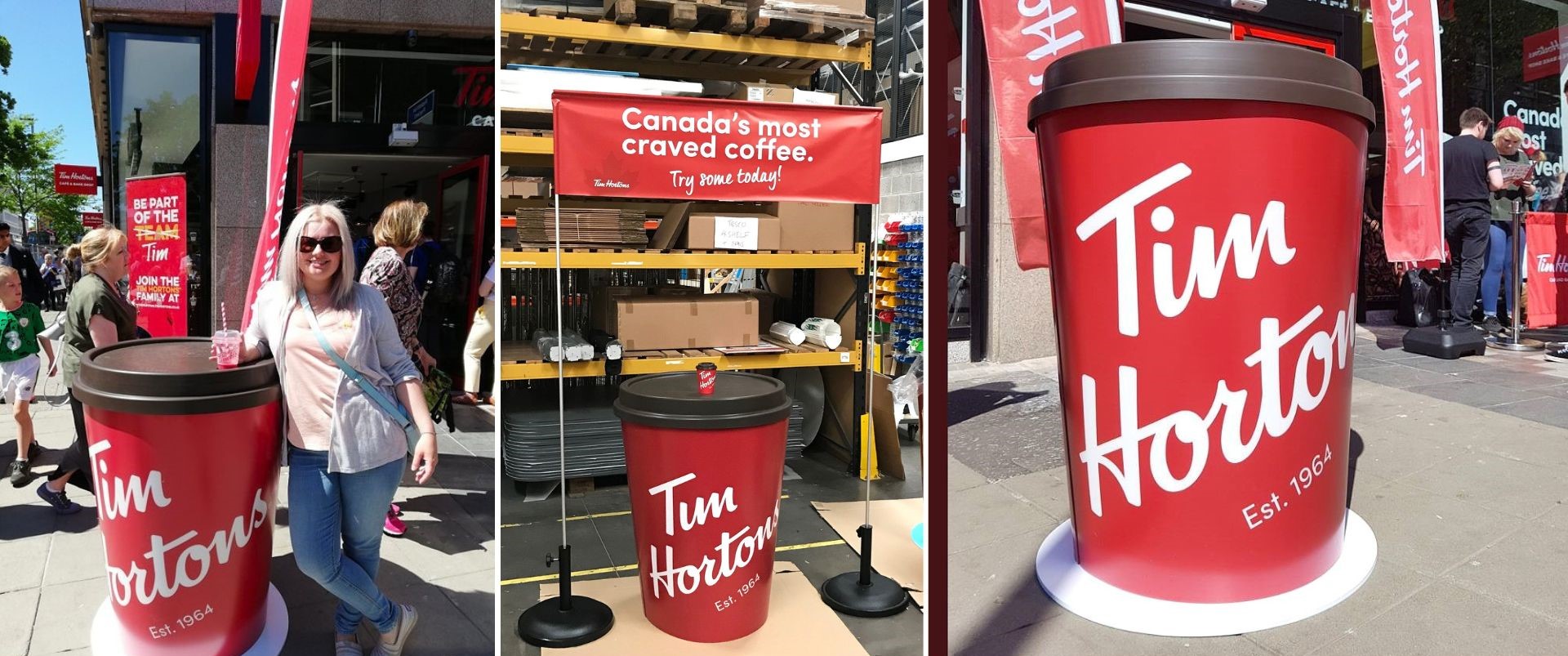
We also had the pleasure to produce banners, and pop up giant cups which were manufactured as flat-pack as staff were transporting it from site-to-site in their cars.
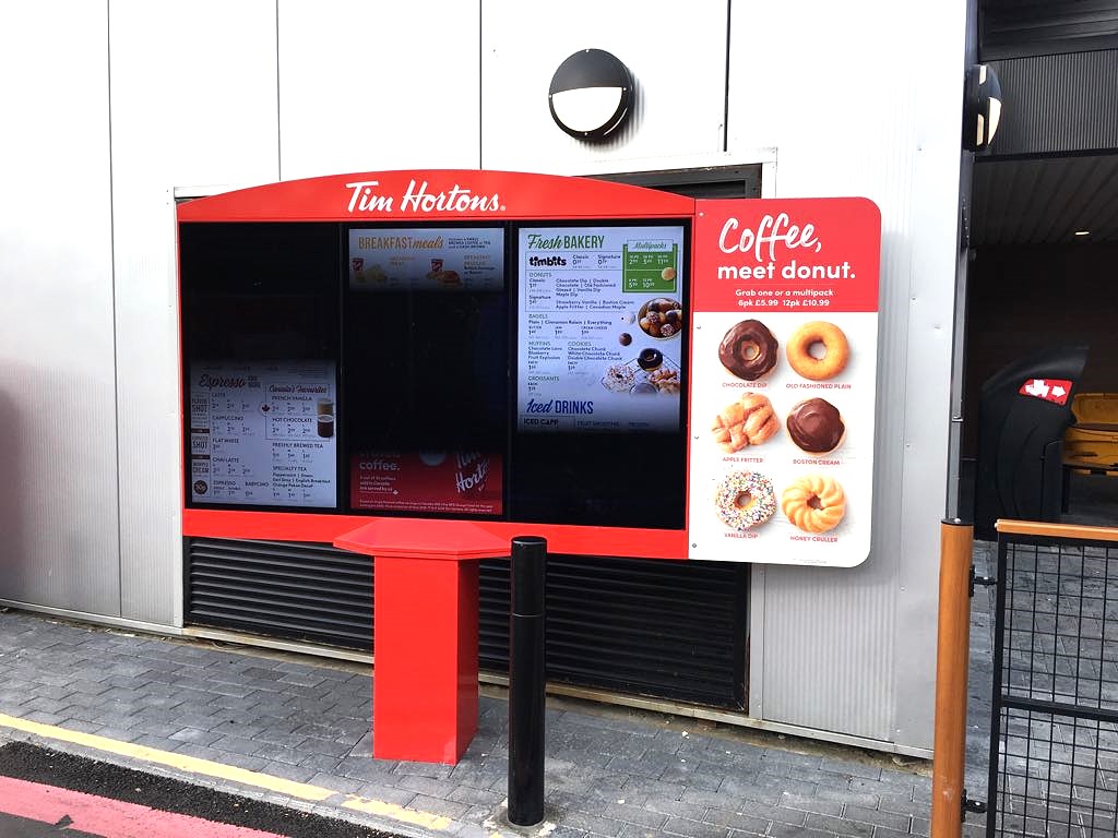
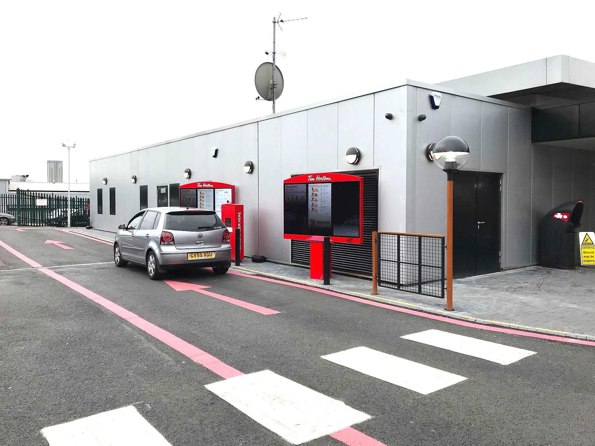
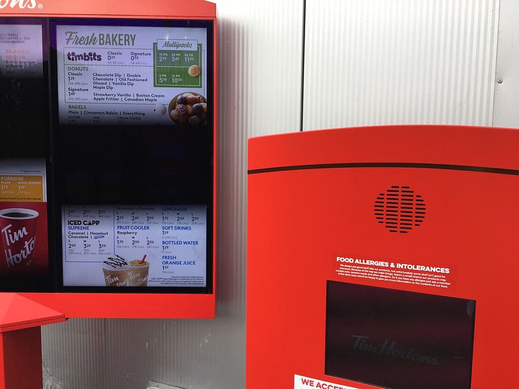
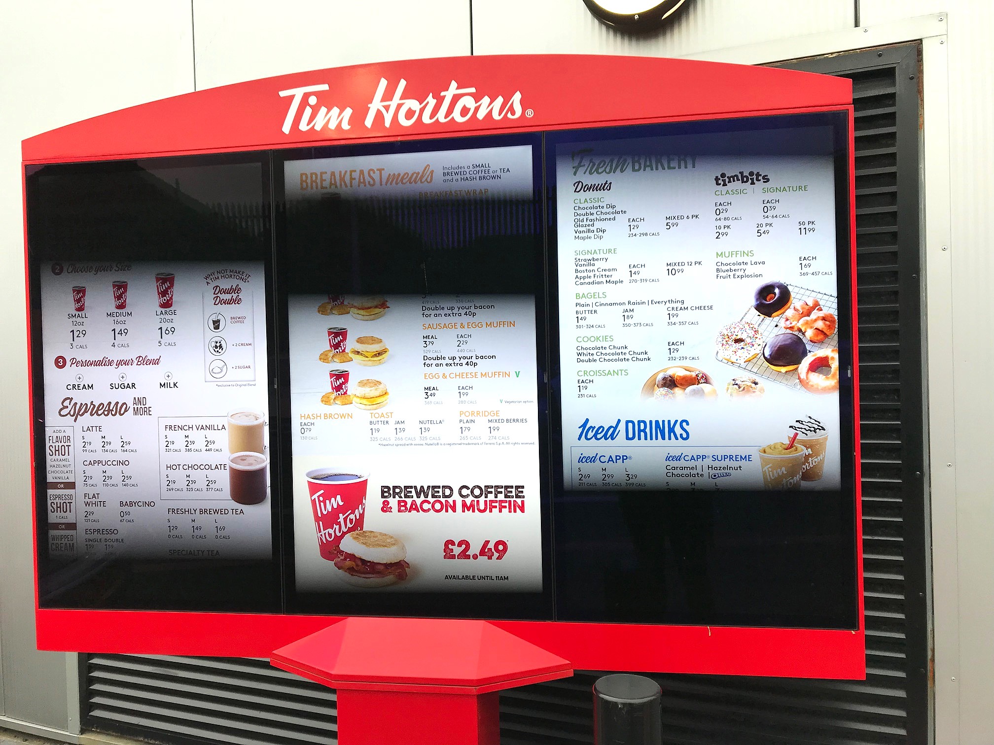
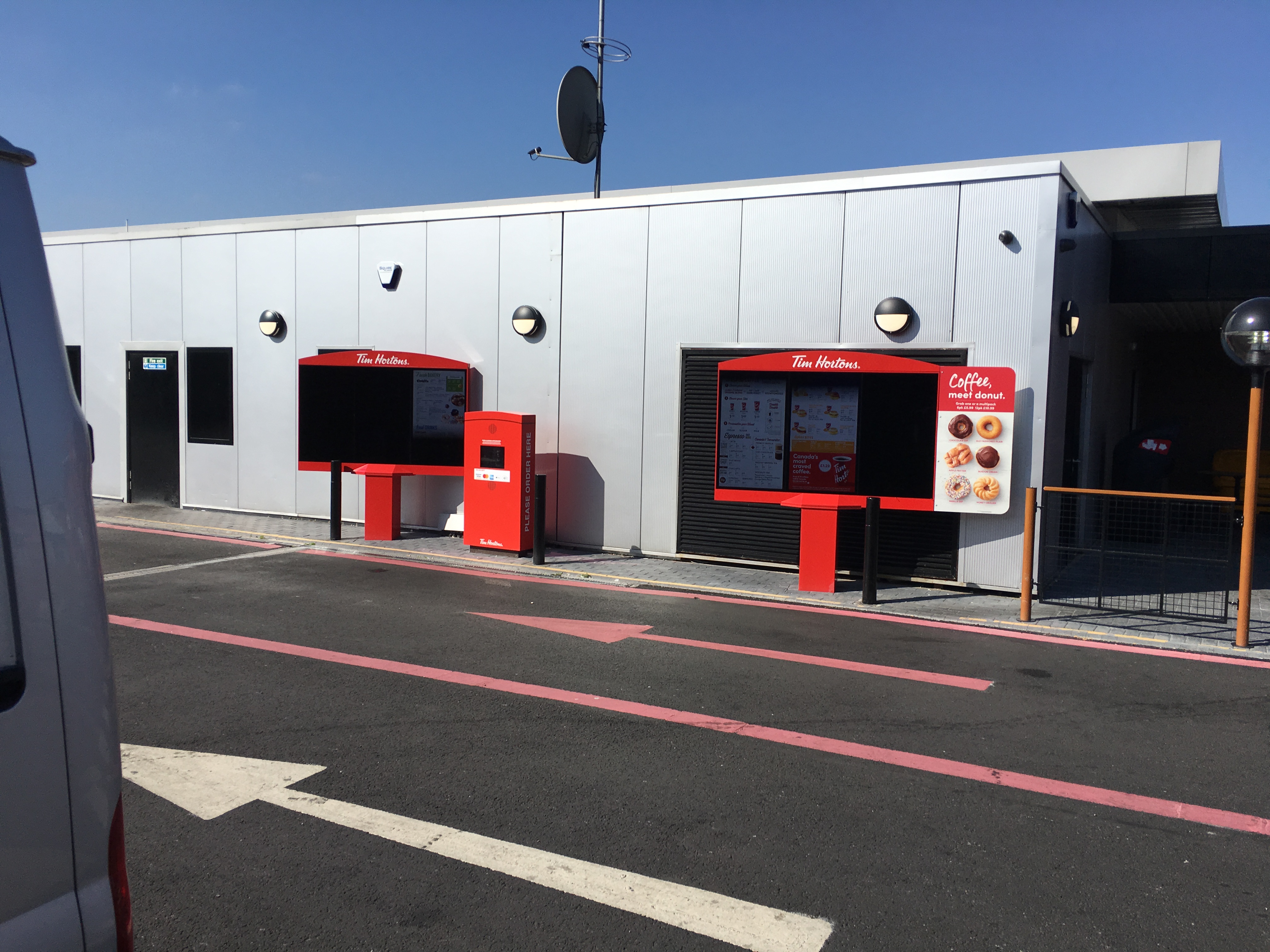
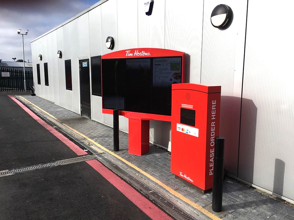
As part of their ongoing goal to introduce and expand their Drive Through locations – we were able to support and execute a permanent installation of their Drive Through speaker systems, digital screens and speaker wings.
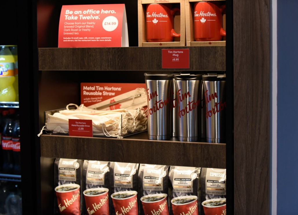
We designed a custom acrylic display tray tailored to fit the linen travel pouches containing the reusable straws and cleaning brushes. The transparent acrylic construction provided a minimalist look, keeping focus on the natural fabric bags and the bold red Tim Hortons branding.
A removable printed back card was added to reinforce brand messaging and product information, including details about the straw’s eco-friendly features.
Some key features included:
– Precision-fit compartments to ensure product alignment and easy restocking.
– Crystal-clear acrylic for high visibility and durability in busy retail environments.
– Custom angled back panel for optimal logo and message display.
– Compact footprint suitable for countertop placement at point-of-sale areas.
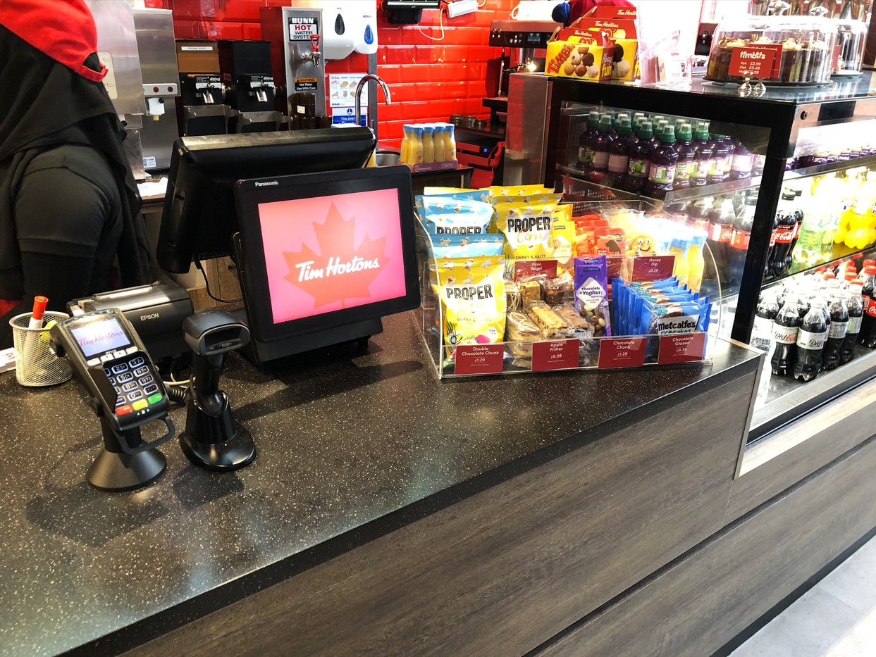
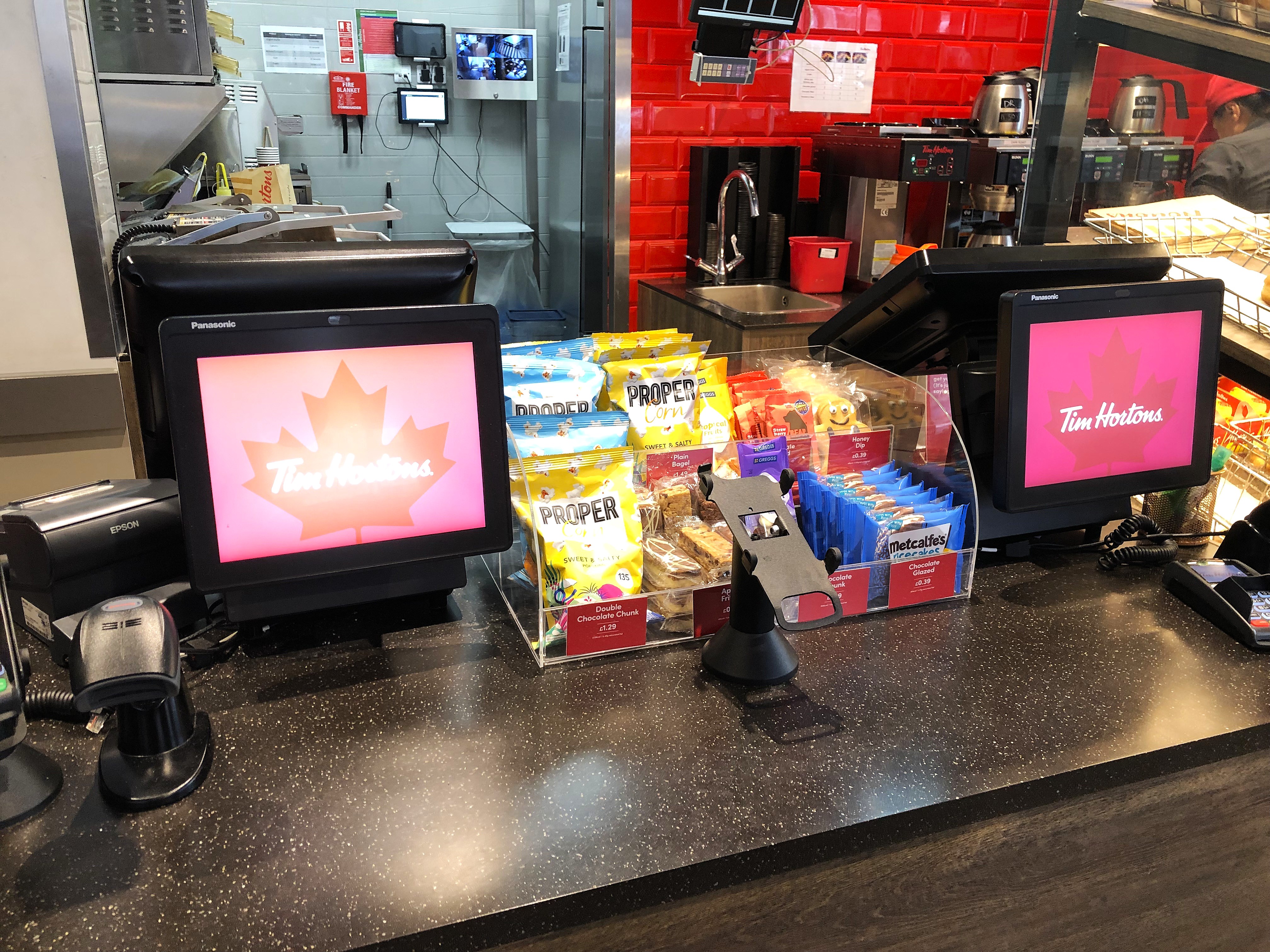
Our design team also created a clear, tiered acrylic display that optimises space and product presentation. Each shelf was precisely measured to accommodate a range of impulse products, ensuring both easy access for customers and effortless restocking for staff.
The display was complemented by interchangeable branded price strips, allowing Tim Hortons to update product promotions and pricing efficiently across multiple locations.
Crafted from high-grade, crystal-clear acrylic, the unit delivers durability and a professional finish, blending seamlessly into Tim Horton’s modern counter design.
Some key features included:
– Custom sizing and tier layout to maximize visibility at point-of-sale.
– Premium transparent acrylic for a clean, brand-aligned aesthetic.
– Modular design with removable dividers and interchangeable price tags.
– Durable construction suitable for high-traffic environments.
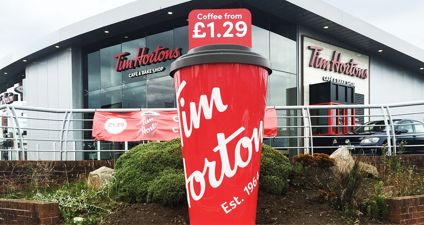
Lastly, we had the pleasure to also design a Giant factice of their infamous Tim Horton’s coffee cup which stands pride of place, at the forefront of their stores and Drive Through locations. The unit was manufactured to withold all weathers and built to last a lifetime.
This key point of sale activation has worked wonders for uplift of brand awareness and sales – driving customers to Tim Horton’s doors/drive throughs, and continues to be a great display asset to Tim Horton’s ongoing campaign.
We loved working with Tom Horton’s on their entire campaig. From design, execution and installation – we were proud to partner on their POS requirements.
If you are looking for campaign, retail display or roll-out support, get in touch with our team today: info@threepd.co.uk